Giant Check for a Charity Donation: How to Design One That Photographs Well
Donation ceremonies live or die by the photo. Here's how to build a giant check that reads clearly in a press release, on a nonprofit's Instagram, and in the local paper.
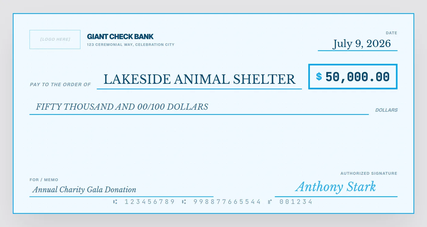
A charity donation check almost always gets photographed twice — once live at the event for the room, and once carefully staged afterward for the press release, the donor's LinkedIn post, and the nonprofit's social channels. Designing for both audiences at once means thinking beyond "does it look like a check" and into "does it read in three seconds on a phone screen."
What goes on a charity presentation check
- Donor name — the company or individual giving the gift, shown as the "bank" / issuing party
- Recipient nonprofit — the payee, in the largest, boldest text on the check
- Donation amount — numerals in the amount box; written out below for the "official" look
- Memo line — the specific fund or cause: "Annual Gala Donation," "Building Fund," "Disaster Relief"
- Date — the ceremony or fiscal-year date
- Signature — the donor's representative or company officer
Design choices that actually matter for the photo
1. Contrast beats decoration
The payee name and dollar amount need to be legible in a photo taken from ten feet away under gymnasium or ballroom lighting. A soft pastel background with light gray text will wash out; dark navy or black text on a clean, light background reads reliably in almost any lighting.
2. Leave room for hands
Two people typically hold the check by its edges for the photo. Keep critical text — the amount, the payee name — clear of the outer 2-3 inches on either side where fingers usually land.
3. Logo placement signals credibility
If a company or foundation is the donor, their logo belongs in the top-left "bank" position — it's the area press photographers and local news crop into most often, and it visually reinforces who's giving the gift.
Matching tone to the cause
A "Luxury" black-and-gold check can feel out of step for a food bank or disaster-relief donation — a softer "Charity" blue theme tends to read as warmer and more appropriate. Save the high-contrast or luxury styles for corporate sponsorship reveals and galas.
After the ceremony: reuse the file
Because the same design exports as both a high-res PNG and a print-ready PDF, nonprofits commonly reuse the exact same file three ways: printed and mounted for the live event, embedded in the press release as a PNG, and cropped into a square or vertical crop for Instagram — no need to design three separate versions.
Build your donation check in minutes
Upload your organization's logo, pick the "Charity" theme, fill in the amount — export a press-ready file the same day.
Open the Free Designer →$10 for the clean, print-ready download · no signup required
Frequently asked questions
What should a charity donation check include?
The donating organization's name, the receiving nonprofit's name, the donation amount in numerals and words, the date, the cause or fund it supports as the memo, and a signature line for the donor or company representative.
Should a charity check show the donor's logo?
Yes, if the donor is a company or sponsor — placing their logo in the top-left "bank" area is standard practice and gives them recognizable brand visibility in press photos.
What color works best for a nonprofit giant check?
Soft blues and clean sans-serif type tend to photograph as approachable and trustworthy, which is why many nonprofits favor a "charity" style over the traditional dark-green bank-check look, though either works.